


For many interior designers, graphic designers, artists, and fans of great colour schemes, the Pantone Colour of the Year choice is a big one. However, in recent years, its choices have missed the mark. And the pick for 2026 is its least colourful yet and potentially its most controversial. Let’s dive into the drama.
What is the Pantone Colour of the Year?
The Pantone Colour of the Year initiative first began in 1999.
The colour standardisation company initially intended the Colour of the Year to be a one-off, done just to mark the new millennium.
However, the self-described “global authority for colour communication and inspiration since 1963” kept the practice up. Now the Pantone Colour of the Year quickly became an annual tradition.
What was the Pantone Colour of the Year pick for 2026?
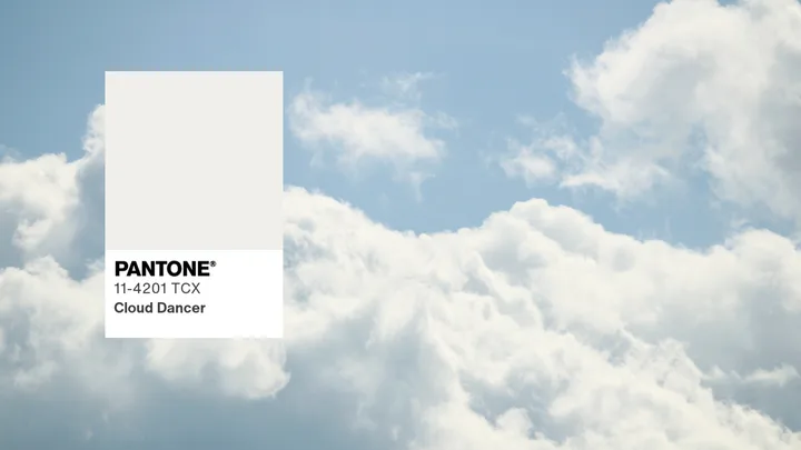
Controversially, the colour pick for 2026 is…. Cloud Dancer. Described by Pantone as a “lofty white that serves as a symbol of calming influence in a society rediscovery the value of quiet reflection.”
Yes, you read that correctly, the colour choice is white.
What was the reaction to the Pantone Colour of the Year?
Not to knock white as a colour choice, it’s just not as exciting as any other hue. And the comments on the announcement post are equally disappointed.
One person commented: “White, by definition, is the absence of colour. This choice shows a stunning lack of creativity…In a moment when colour is used to express culture, diversity, emotion, and innovation, choosing a white-based shade feels tone-deaf at best.”
Another person joked: ” The colour of the year being colourless is a recession indicator.”
However, Pantone defends its choice by saying that “Cloud Dancer demonstrates our desire for contentment and feelings of peace, unity, and cohesiveness.”
“One of my favourite ways to begin again is going somewhere new, ” said painter and illustrator Sara Boccaccini-Meadows, in Pantone’s announcement video. “A blank page makes me feel excited for the journey ahead.”
“It may not be the most inspiring choice… but I do agree with the intention,” says Joshua Beggs, The Australian Women’s Weekly‘s Creative Director. “Fresh, clean with a sense of calm and serenity. In design, white space plays a critical role in allowing our brain to reduce the work it takes to let inspiration and information shine through. Like most previous years, Pantone Colour of the year reflects the time we are in and our state of mind more than just a trend.”
What are the Pantone Colour of the Year picks over the years?
Here are all the Pantone Colours of the Year since their inception.

2000: Cerulean
A serene blue reflecting calm, stability, and optimism was chosen for the new millennium.

2001: Fuchsia Rose
This bold pink symbolises confidence, empowerment, and femininity.
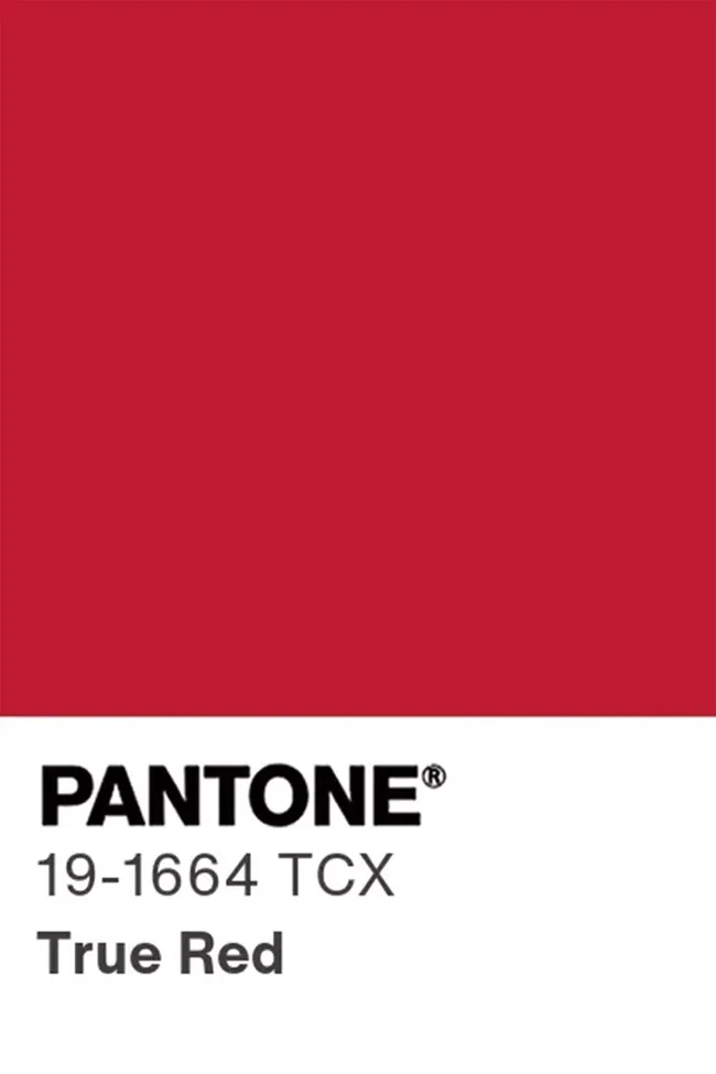
2002: True Red
A passionate, timeless red, which evokes strength and love, was chosen for 2002.

2003: Aqua Sky
This tranquil aqua projects rejuvenation and hope.

2004: Tigerlily
For 2004, Pantone went with a vibrant orange which blends energy with exoticism, ultimately symbolising renewal.

2005: Blue Turquoise
Calming and inviting, this tone reflects escapism and relaxation.

2006: Sand Dollar
Neutral and grounded, Sand Dollar was chosen during times of economic uncertainty to reflect simplicity.

2007: Chili Pepper
This fiery red evoking energy, excitement, and passion, was chosen for 2007.
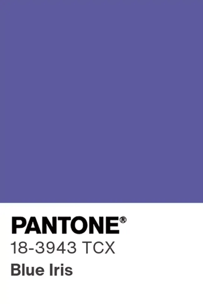
2008: Blue Iris
A blend of blue and purple, Blue Iris evokes intuition and spirituality.

2009: Mimosa
A warm yellow, Mimosa is a symbol of optimism and creativity in challenging times (the GFC was still in full swing when this colour was chosen).

2010: Turquoise
Combining serene blue with invigorating green, Turquoise reflects healing and escape.

2011: Honeysuckle
A lively pink symbolising courage and uplifting the spirit.

2012: Tangerine Tango
This dynamic orange radiates energy, optimism, and creativity.

2013: Emerald
For 2013, a lush green symbolising prosperity, renewal, and balance was chosen.

2014: Radiant Orchid
A harmonious purple pink, fostering creativity and confidence, was picked for 2014.

2015: Marsala
Marsala is a robust, earthy red wine colour, which evokes sophistication and stability.

2016: Rose Quartz & Serenity
In 2016, for the first time, two colours were chosen: A soft pink and blue, representing peace and equality.

2017: Greenery
A fresh, zesty green symbolising new beginnings and growth was perfect for 2017.

2018: Ultra Violet
This bold purple symbolises individuality, creativity, and innovation.

2019: Living Coral
A lively coral tone that gives warmth, nature, and connection was chosen for 2019.

2020: Classic Blue
Classic Blue is a dependable, deep blue that represents stability and trust.

2021: Illuminating & Ultimate Gray
After the COVID-19 Pandemic took over the world, Pantone chose two colours for 2021: A contrast of stable grey and sunny yellow for resilience and hope.

2022: Very Peri
A vibrant blue-violet hue was picked for 2022 as it represents transformation and creativity in a digital age.

2023: Viva Magenta
A bold crimson red which celebrates strength, vitality, and nature’s inspiration.

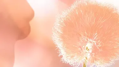
2024: Peach Fuzz
For 2024, this soft peach symbolising warmth, optimism, and connection was chosen.
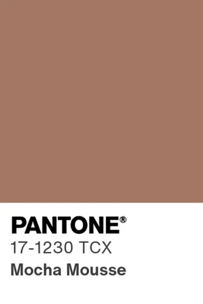
2025: Mocha Mousse
For 2025, this warming, brown hue symbolising richness with a suggestion of delectable chocolate and coffee was chosen.

2026: Cloud Dancer
Potentially Pantone’s most controversial colour pick is its least colourful.